Refreshed, Renewed, Redesigned
Revitalising the brand: A refinement take on the logo design.

My Role
Logo Redesign
The Task
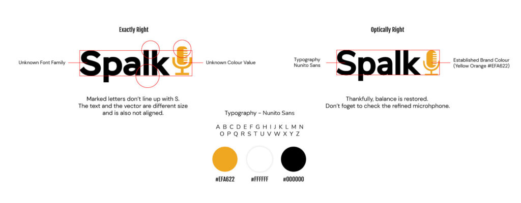
1. The task was to redesign the logo, because the old is a stock free vector and an unknown font.
2. Calling, getting to know the brand, discussing the details: scope of work, deadline.
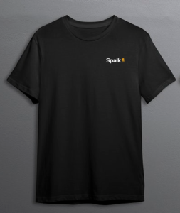
3. Presentation of logo options with visualization on its media. We agree on the final version of the logo.
4. Preparation and sending of a set of sources - all versions of the logo in corporate colors and versions for the Internet and print
Timeframe
3 days
Summary
Company: Spalk
Team: Product Manager, Higher Officials
Outcome: Improved brand perception: A logo redesign can help modernize a brand's image and make it more appealing to customers, which can lead to improved brand perception.
"It's amazing to see how big of an impact a small change can make "
- Spalk CTO
1.
Tools + Techniques
Research
Identify
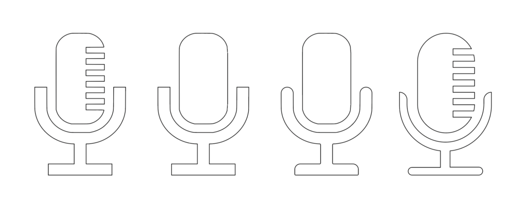
Identify the specific objectives of the redesign, including updating the brand image, typography and simply modernising the existing logo.

Free stock vector, inconsistent typo, unknown font and colour

2.
Tools + Techniques
Sketch
Refine

3.
Tools + Techniques
Feedback
Launch

Shared the refined designs with the team and received feedback on which designs they like best. Made final revisions based on team feedback and refined the final design for delivery.

